
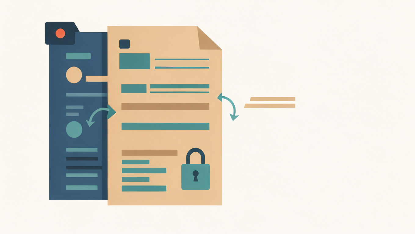
How OCR Turns a Photo into Editable Text
A photograph of a printed page is not text. It is a grid of coloured pixels that happens to look like letters to you. OCR, or optical character recognition, is the step that turns those shapes back into characters you can select, copy, and correct.
Image to Text OCR runs that step on a photo or a scan in your browser. It handles clean, straight, evenly lit pages well and struggles with the ones people take in a hurry.
Quick answer
OCR locates likely text, divides it into lines and characters, and matches those shapes against known letterforms. It needs contrast and a steady angle more than a high pixel count. Straighten the page, fill the frame with the text, and proofread the output before you rely on it.
What happens inside OCR
The process runs in stages. First the tool finds regions that look like text and separates them from images, rules, and margins. Then it groups pixels into lines, words, and individual characters. Finally it compares each character with the shapes it has learned, uses the surrounding words to resolve ambiguous ones, and assembles the result in reading order.
That last part is why OCR sometimes returns a sensible word where the original had a smudge: the recogniser fills gaps using what it expects to see. That is helpful on ordinary prose and dangerous on reference numbers, where a guessed character can be wrong in a way that still looks plausible.
What makes a photo easy to read
- Shoot from directly above the page, not at an angle.
- Light it evenly; a shadow across the text lowers contrast.
- Fill the frame with the text, leaving a small margin.
- Keep the page flat, especially near the spine of a book.
- Avoid glare from glossy paper, screens, or a flash.
Sharp focus matters more than resolution. A slightly soft image at high resolution produces worse results than a crisp one at a modest size. If the file is very large, compressing it first can make it quicker to handle without changing the result; Image Compressor does that in the browser.
Where OCR fails
Handwriting is the obvious limit, particularly joined-up script and signatures. Decorative fonts, very small type, low-contrast grey text, and text printed over a photograph all cause errors. Receipts are difficult because the paper curls and the print is often faint. Tables and multi-column layouts confuse reading order, so lines from adjacent columns can end up interleaved.
Stamps, highlighting, and handwritten notes over printed words tend to break the characters underneath. If a document has a stamp across the text, a second photo taken from a slightly different angle may read better.
Getting a usable result
Crop to the text before running OCR, then read the output against the original rather than skimming it. Check names, numbers, and punctuation first; those are the details that matter and the ones OCR is most likely to change. Keep the original image until you have verified the text.
If the page contains personal details and you plan to share the scan as well, clean it afterwards with Redaction & Metadata Cleaner.
Try it on a page you already have: open Image to Text OCR, add the photo, and copy the text out. If the result is poor, retake the photo straight and evenly lit before adjusting anything else.
Common questions
Why does OCR sometimes return a wrong word that looks plausible?
The recogniser uses surrounding words to resolve ambiguous characters, so it can fill gaps with what it expects to see. That helps on ordinary prose but is risky on reference numbers, where a guessed character can be wrong and still look believable. Check names, numbers, and punctuation against the original first.
How should I photograph a page so OCR can read it?
Shoot from directly above the page, light it evenly, and fill the frame with the text while leaving a small margin. Keep the page flat, especially near the spine of a book, and avoid glare from glossy paper, screens, or a flash. Sharp focus matters more than a high pixel count.
Can OCR read handwriting or a receipt?
Handwriting is one of the obvious limits, particularly joined-up script and signatures. Receipts are difficult because the paper curls and the print is often faint. Decorative fonts, very small or low-contrast type, text printed over a photograph, stamps, highlighting, and multi-column layouts can also cause errors.